Very Mobile Ecommerce 2.
My role: UX and UI
Year: 2013/15 (Please keep this date in mind when you read the case study)
Most of my work in early 2015 was centered around improving the mobile experience for Very.co.uk.
We started with the homepage and then turned out attention to the campaign and editorial pages that had always been an afterthought when the desktop version was finished.
It started with a holiday.
Whilst working on the Very mobile homepage we wanted to take some of the learnings from that project and apply them to the inspirational events and campaigns on mobile. From now on we'd be supplying retina graphics and had agreed with marketing to use far less copy on mobile.
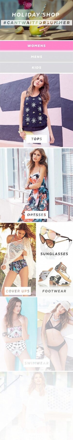
The first opportunity I had to do that was with the launch of the Very Holiday Shop. The photographic assets were fantastic so the approach was to give them as much space to breath as possible. Cells were organised by product category and the page ended up being pretty long ...
Far too long actually. The heatmap showed few scrolls to the bottom of the page, and we lost 85% of our click throughs after the top third. The selecter between womens, mens and kids is also hard to nail on mobile. It's not immediately obvious to customers that you can swap between genders.
The page also had no back to top button so after that long scroll, unless you knew the shortcut to take you to the top again, you would have to scroll yourself and then change the gender.
A change of perspective.
Trying to form an accurate conclusion from this isn't particularly straightforward. Did customers not click because the page was too long or because the product categories were too diverse? When we have multiple pages for genders how can we make that easier to navigate?
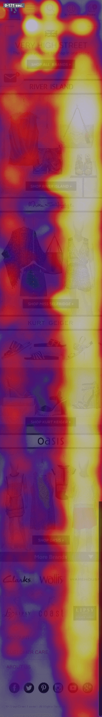
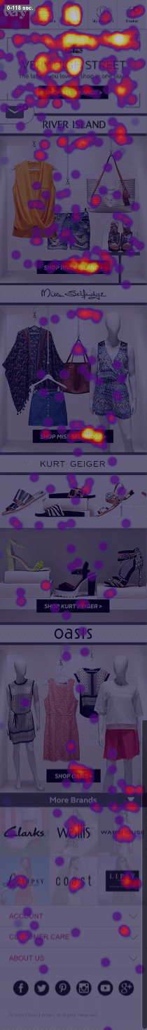
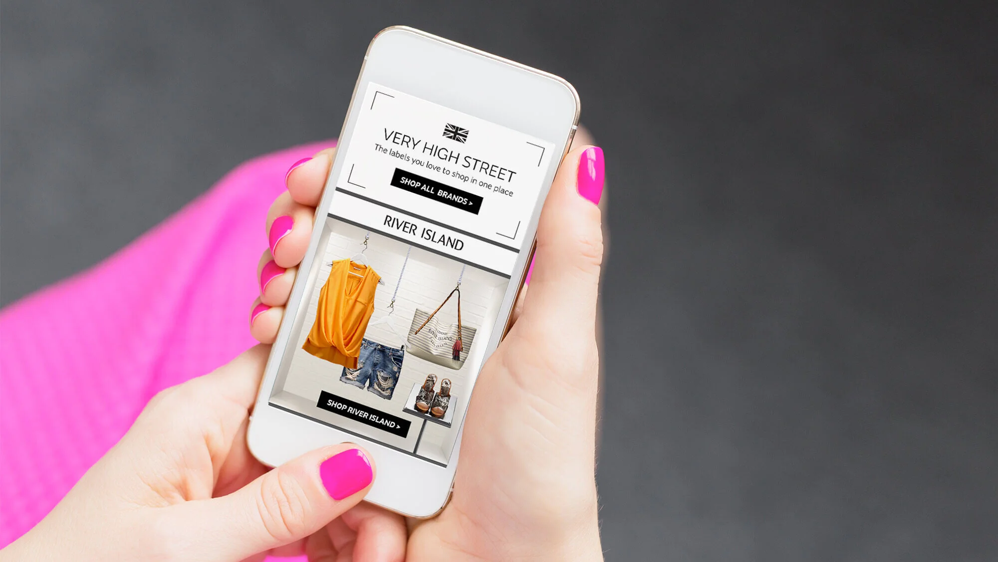
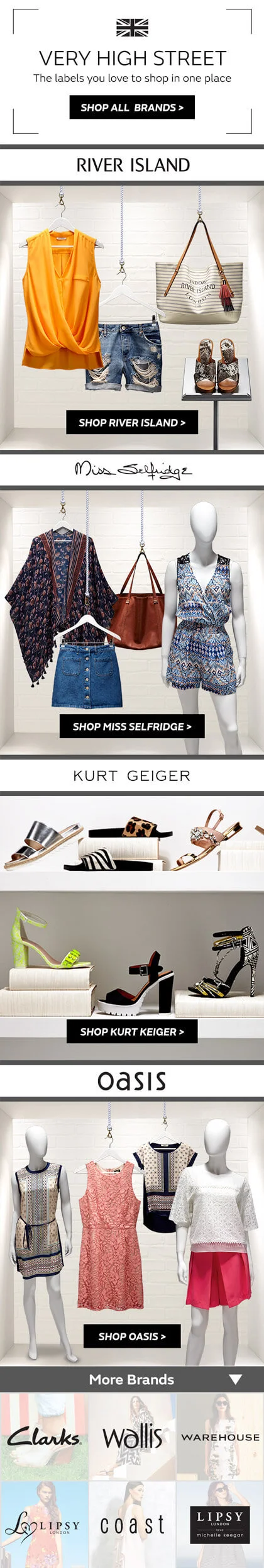
The next big event that came along was Very High Street, a showcase of all the high street brands Very stocks. Approximately 12 brands were featured on desktop, but it was quickly decided this many brands was inappropriate for mobile.
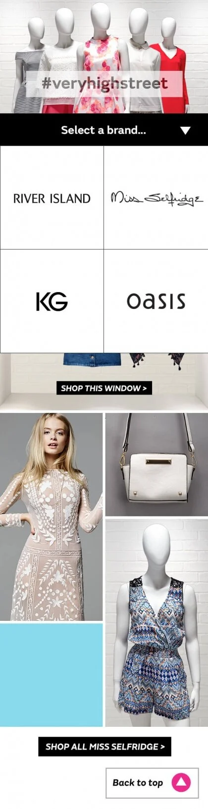
Initial wireframes focused on making mini brand stores and easy navigation between brands - this was a response to having too long a page. However within the timescale we had to produce this, we couldn't code the nav idea's we had wanted.
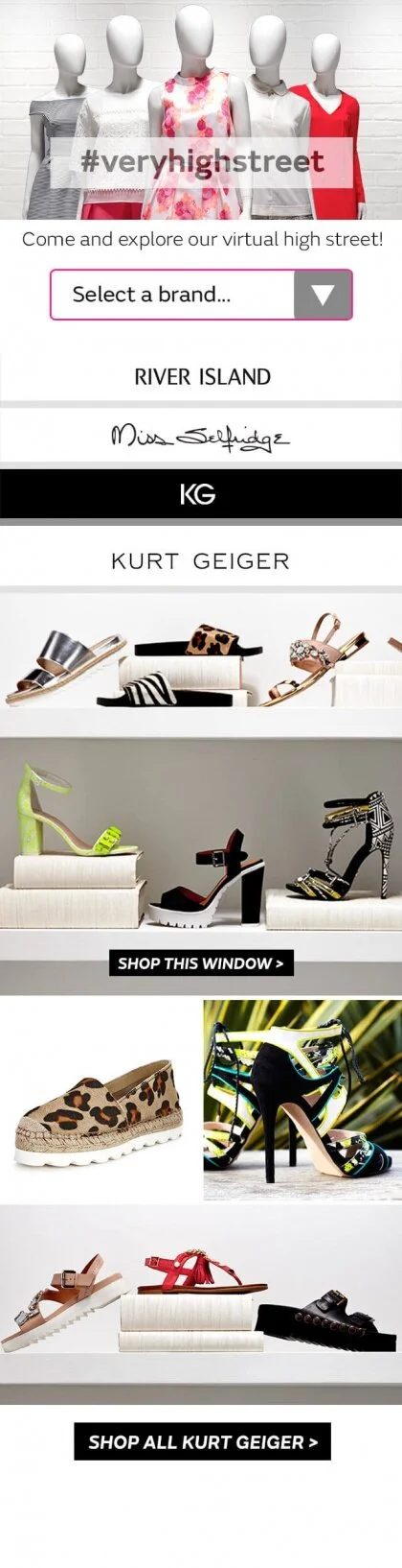
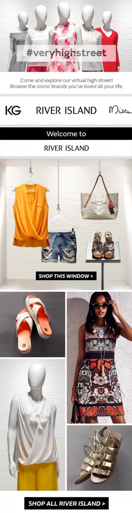
This forced me to simplify the design, and it was better for it. The customer journey was now centered around 'shop windows' for each brand that would click through to a curated gallery page for that brand. Previous iterations had featured individual products for each brand and a mix of model and still life photography, however this would mean a lot of back and forth clicking for the customer if they wanted to shop the whole range.
We featured 4 brand 'shop windows' - River Island, Miss Selfridge, Kurt Geiger and Oasis. The rest of the brands I made into a grid so their brand stores were still available, and to keep the length of the page down
What did we learn?
Although scrolling is now a very common behaviour on mobile devices, I think that in terms of ecommerce, there has to be a strong motivation to keep going as a customer. On campaigns like Very Hight Street, the content is inspirational and curated so scrolling has a reasonable reward. Compared to category shouts like on the ‘Holiday Shop’ page, where the lines could easily have been condensed or cut altogether, the motivation is weaker.
The heat maps provided some evidence to support this, on the Very High Street page we can see that customers scrolled all the way to the bottom, and having the additional brands at the bottom still saw them clicked through.