Very Mobile Ecommerce 1.
My role: UX and UI
Year: 2013/15 (Please keep this date in mind when you read the case study)
This project initiated when Shop Direct's creative director challenged us to make Very 'famous for mobile'. Although 60% of Very's traffic comes from mobile devices, customers weren't receiving the best experience possible on mobile devices. Plenty of experiments and iterations we're happening from the UX team, but creative had little to do with improving the mobile site. Campaigns and artwork for mobile were mostly provided in a rush after the desktop and print executions had been completed.
Where we started.
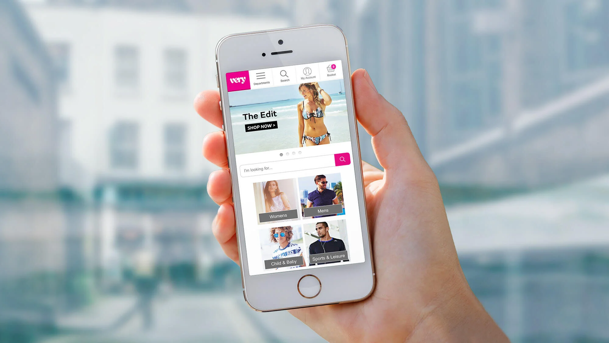
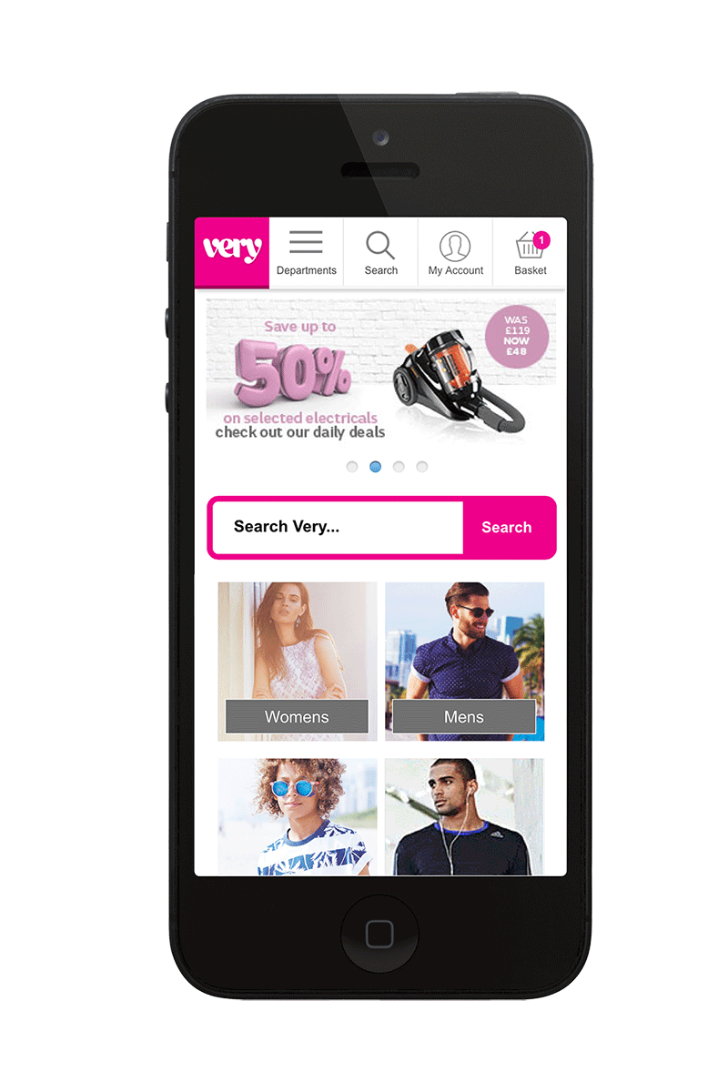
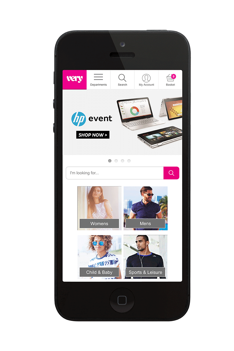
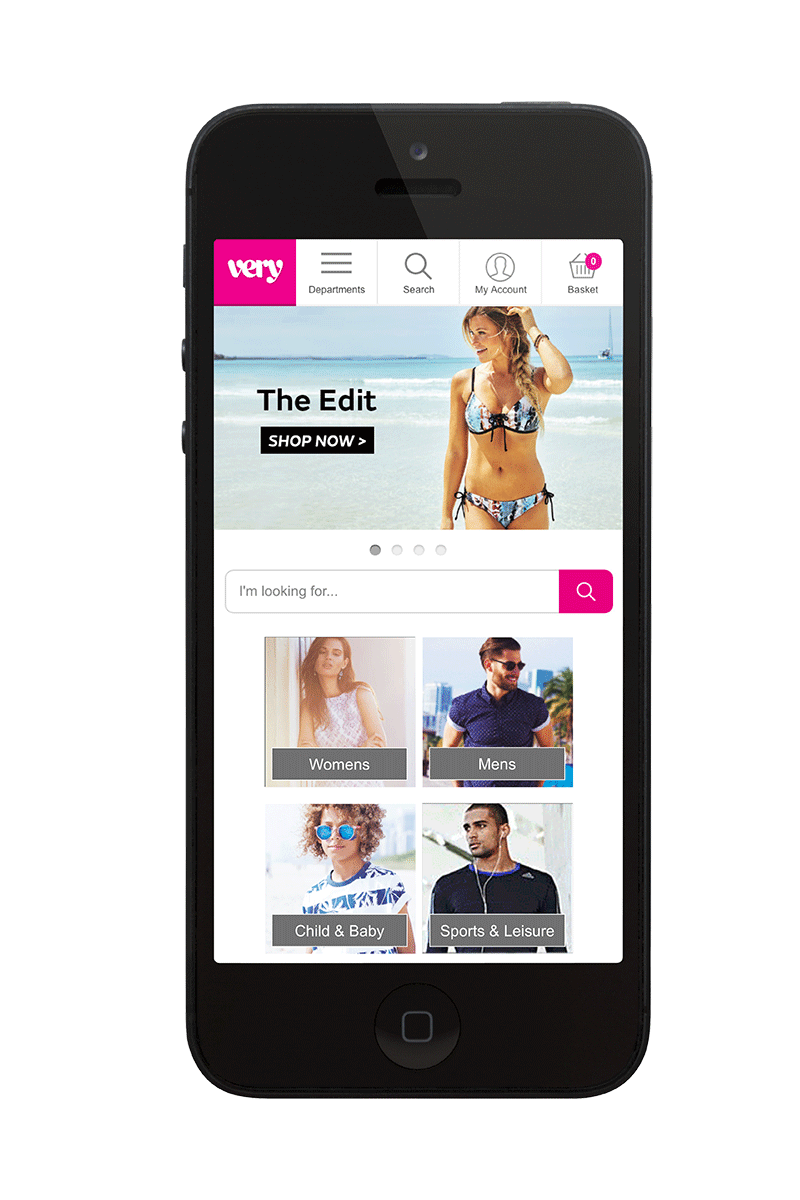
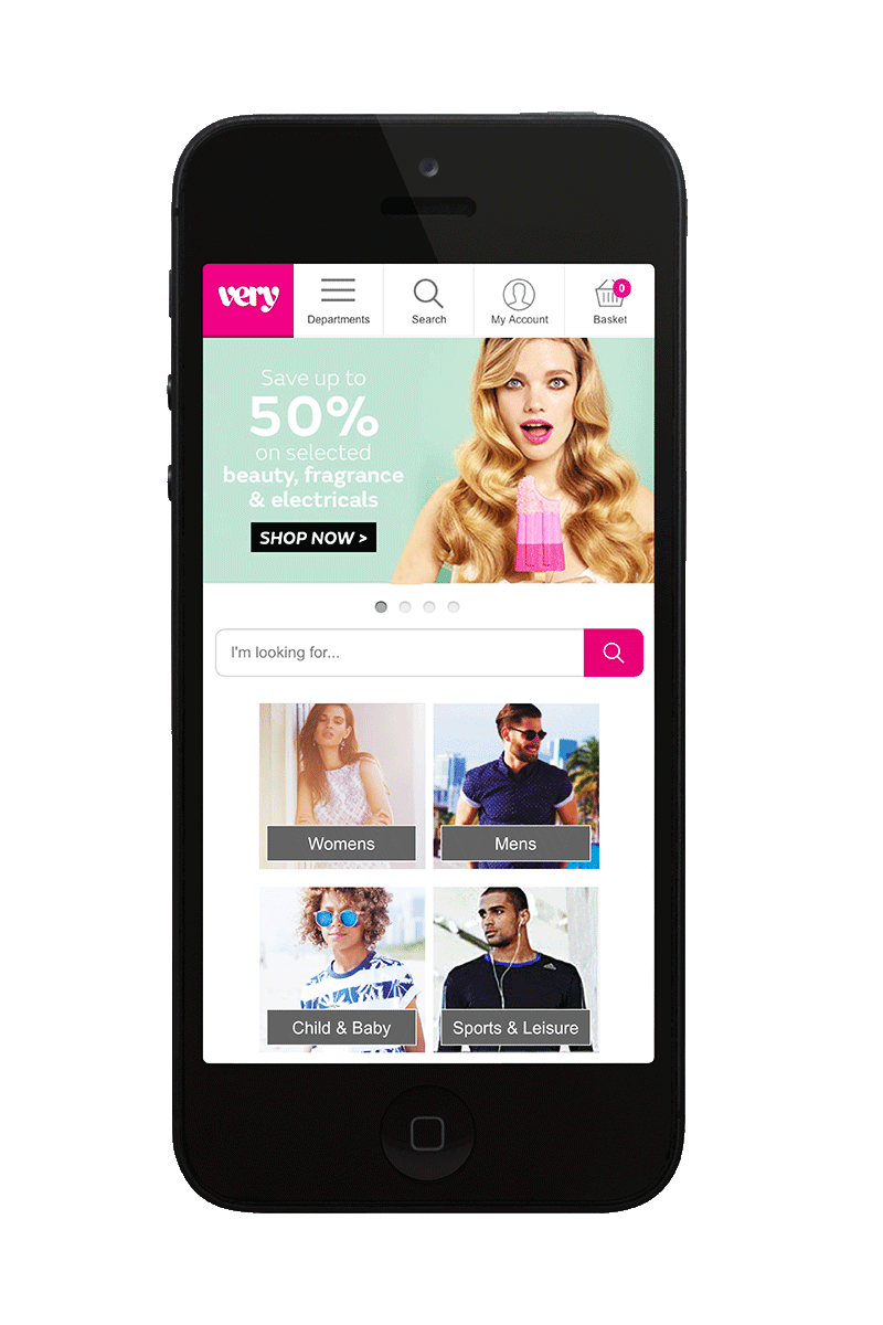
In January 2015 this is what the Very mobile site looked like - a carousel with 3 - 4 rotates and tiled navigational cells underneath. Most large ecommerce stores use a separate mobile site and this was no different for Very. Artwork was supplied to non-retina specifications and complex offers were being squeezed into unfeasibly small spaces.
This was especially relevant when financial offers such as Buy Now Pay Later were involved. Text was added to the graphics embedded in the image, and was often as small as 10px, when minimum recommended font size is between 16px- 22px. Some artwork used call to actions and others didn't, and consistency of size and placement wasn't happening.
Other problems.
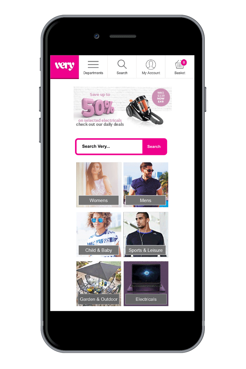
The carousel was non-responsive, so on devices larger than iPhone 5 there was a lot of wasted screen space. This was increasingly an issue as larger handheld devices were becoming more common.
We know that customers with larger devices are more likely to spend longer on the site and consume multimedia content, but we weren't taking advantage of this opportunity.
Some of the photography from our campaigns was too complex to use in the small space we had to work with for mobile, so another opportunity was being missed here.
First steps.
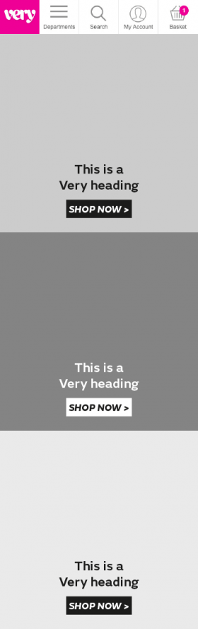
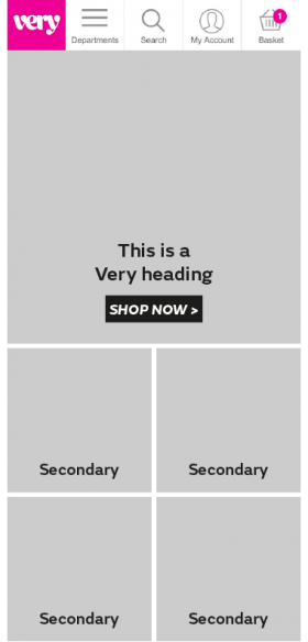
Every change we make to the site is tested, so our approach was iterative rather than an immediate transformation. We wanted to increase the space we had available for our primary images in the carousel and to make this area responsive to device size. Our other priority was simplifying how much text was placed on a graphic, and to have consistent use of call to actions.
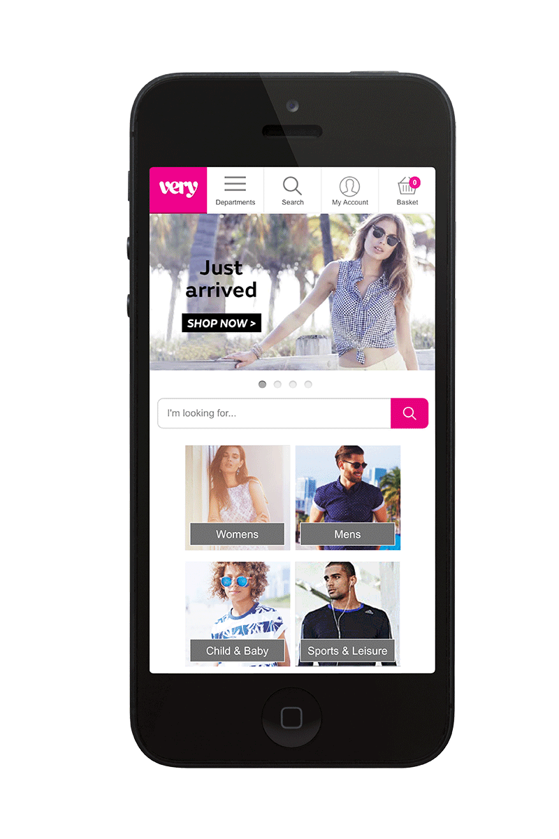
Although we wanted to use a larger banner, we compromised on a graphic size that matched that of the new Very app, which could then be updated regularly to match the site offers. The graphics also behave differently in portrait mode so that the navigational tiles are still visible.
Wireframes and iterations.
The larger responsive banner survived testing and became the base for our next iterations. Proposals currently being tested include adding secondary offers beneath the primary cell, stacked deeper primaries in several iterations and using a dynamic content carousel.
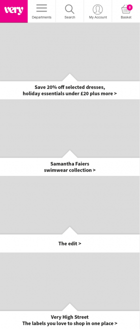
We also want to test the use of call to actions on the graphics at all. We are working towards using a web font instead of embedding the text into the graphic and some of our tests along the way to achieving this have done away with call to actions. The Very online style usually has call to actions and text to the left of a cell, but we know that most customers are right handed and scroll with their thumbs, so either centering or placing call to actions on the right might be more effective.